How to build a BeeRanked plugin
A plugin changes how your BeeRanked hub looks without touching your content. It holds CSS, a few tags for the page head, and small pieces of HTML placed at fixed points of the layout. The honeycomb look on this site is one plugin, and every block of it is printed below so you can copy it and change the values.
What a plugin holds
A plugin is data. BeeRanked stores it with your brand and writes it into every page when the page is rendered. It has three parts:
Custom CSS, added after the hub's own styles.
Head HTML, for tags that belong in
<head>: a font stylesheet, a verification<meta>, a<link>.Slots, six named places in the layout where your HTML is inserted.
A plugin cannot run JavaScript. The filter described further down removes scripts before a page is stored, so a plugin can be shared or imported without reading it line by line first.
Why your CSS wins without a fight
The hub's base rules are written inside :where(.br-app). A selector inside :where() has a specificity of zero (MDN, :where()), and your CSS is added after the hub's own. So a plain rule such as .prose a { color: darkred; } applies. You do not need !important, and you do not need to copy long selectors out of the page source.
Start with the tokens
Colours, corners, shadows and fonts in the hub are read from CSS custom properties, which CSS resolves wherever a rule uses var() (MDN, using CSS custom properties). Set them once on :root and the nav, the cards, the buttons, the article body and the footer all follow.
| Token | What it sets |
|---|---|
--bg | Page background |
--bg-warm | Footer and warm surfaces |
--bg-muted | Hover states and quiet fills |
--text | Body text |
--text-muted | Secondary text |
--border, --border-light | Borders and dividers |
--brand | Accent colour: buttons, highlights |
--brand-mid | The accent in a shade dark enough for link text |
--brand-light | A pale tint of the accent |
--on-brand | Text placed on the accent colour |
--radius, --radius-lg | Corner rounding |
--shadow-sm, --shadow-md, --shadow-lg | The three shadow depths |
--font | Body font |
--display-font | Headings and the name in the nav |
:root {
  --bg: #FFF8E1;
  --text: #1A1A1A;
  --brand: #FFC629;
  --brand-mid: #8A5A00;
  --radius: 12px;
  --shadow-md: 5px 5px 0 #1A1A1A;
  --display-font: 'Bricolage Grotesque', sans-serif;
}
Seven lines restyle the hub. Reach for a class selector after that, for the details tokens do not cover.
Fonts
There are two ways to load a typeface.
Paste a Google Fonts stylesheet link in the Head HTML field. BeeRanked fetches that stylesheet when it renders the page, keeps the Latin subsets and writes the @font-face rules into the page itself, so your visitor's browser makes no extra request for the stylesheet.
Or host the file yourself and declare it in the custom CSS:
@font-face {
  font-family: 'Bricolage Grotesque';
  font-weight: 200 800;
  font-display: swap;
  src: url('https://yourbrand.com/fonts/bricolage.woff2') format('woff2');
}
font-display decides what the reader sees while the file loads; swap shows the fallback font first and replaces it when yours arrives (MDN, font-display). Then point --display-font or --font at the family name.
The six slots
| Slot | Where it lands |
|---|---|
banner | A full-width strip above the nav |
header_end | Inside the nav, after the links |
before_content | Top of the page body |
after_content | Bottom of the page body |
footer | Inside the footer |
not_found | The body of the 404 page; the nav, footer and theme stay around it |
An empty slot produces no markup.
What the filter removes
Everything a plugin contributes passes through one filter before it reaches a page.
From HTML it removes <script> tags, inline handlers such as onclick and onerror, the srcdoc attribute, and any javascript:, vbscript: or data:text/html address in href, src, action and the other attributes that take a URL. From CSS it removes expression(, behavior:, and anything that would close the style block early.
<link>, <meta>, <style> and ordinary markup are kept.
If you need a script, for analytics or a chat widget, that is a separate setting: Settings, Site scripts. It works only on your own domain, never on the shared hosted address.
Contrast is corrected for you
When one rule sets both a text colour and a solid background colour, BeeRanked measures the pair. WCAG asks for a contrast ratio of at least 4.5 to 1 for normal text (W3C, Understanding Success Criterion 1.4.3). A button with background: #1F7FC9; color: #fff comes out at 4.25 to 1, so the background is darkened by the few percent needed to pass. Gradients, images and colours set through var() are left as you wrote them.
The honeycomb theme, block by block
This is the plugin running on this site.
1. The palette
:root {
  --bg: #FFF8E1;
  --bg-warm: #FBEFC8;
  --bg-muted: #F3E9C8;
  --border: #1A1A1A;
  --border-light: #E4D9B4;
  --text: #1A1A1A;
  --text-muted: #5C5640;
  --brand: #FFC629;
  --brand-mid: #8A5A00;
  --brand-light: #FFEFB8;
  --on-brand: #1A1A1A;
  --radius: 12px;
  --shadow-md: 5px 5px 0 #1A1A1A;
}
2. A faint background pattern
The hexagons are an SVG written inside the CSS, so the browser has nothing more to download.
body {
  background-color: var(--bg);
  background-image: url("data:image/svg+xml,%3Csvg xmlns='http://www.w3.org/2000/svg' width='56' height='96'%3E%3Cg fill='none' stroke='%231a1a1a' stroke-opacity='0.05' stroke-width='1.4'%3E%3Cpath d='M28 0l24 14v28L28 56 4 42V14z'/%3E%3C/g%3E%3C/svg%3E");
}
The stroke opacity is 0.05. At 0.2 the pattern competes with the text.
3. A dark footer
footer {
  background: #1A1A1A;
  color: #FFF8E1;
  border-top: 4px solid var(--brand);
}
.footer-inner, .footer-inner a, .footer-brand { color: #EDE6CF; }
4. The article body
Article text sits inside .prose.
.prose a { color: var(--brand-mid); text-decoration-color: var(--brand); }
.prose h2 { border-bottom: 2px solid var(--brand-light); padding-bottom: 0.3rem; }
The homepage hero needs a longer selector
The hero and the cards on the homepage carry their own scoped styles. In the page source the rule reads .hero[data-astro-cid-olietvfj], which counts as two classes, and a rule with two classes beats your rule with one (MDN, specificity).
Tokens still reach the hero, because its own rules read them. To change its layout or spacing, put the element name in front of the class:
section.hero .hero-title { letter-spacing: -0.02em; }That selector outweighs the scoped one. The structure of the hero changes with the hub template you pick in Settings, so check the homepage again after switching template.
Apply it
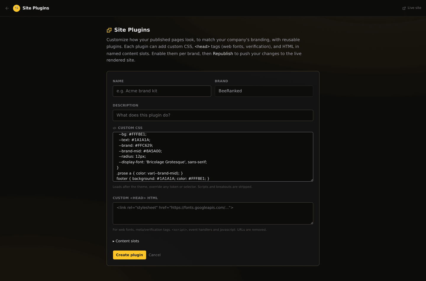
Open Plugins in the dashboard and choose the brand in the header.
Create a plugin, or use Import to load a
.jsonfile.Paste your CSS, your head HTML and the slots you use.
Switch the plugin on.
Press Republish to apply. Your pages are stored as static files, so a change that touches every page is written out again; the page shows the progress.
An import file looks like this:
{
  "name": "Honeycomb",
  "description": "Cream paper, honey accent, hard shadows",
  "customCss": ":root { --brand: #FFC629; }",
  "headHtml": "",
  "slots": { "banner": "<p>New: the changelog is live.</p>" }
}
The same thing from an AI agent
The MCP server has an upsert_plugin tool that takes the same fields: custom_css, head_html, slots. Calling it with the name of an existing plugin updates that plugin and keeps the fields you did not send. It has two switches the dashboard does not show, hide_header and hide_footer, which leave the default nav or footer out of the HTML so you can supply your own in the banner and footer slots.
Before you call it done
Open one article and the homepage at phone width and on a desktop. The article shows your .prose rules, the homepage shows what the tokens did to the hero and the cards. Then read a link on your lightest background: if it is hard to read, darken --brand-mid.
Want to try this on your own site?
Everything in this guide runs from one studio: connect your domain, publish, and the SEO side is done for you.